
Visit Camarillo’s New Brand Identify
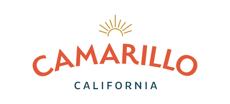
After months of strategic planning, design changes and color options, Visit Camarillo’s has a new brand identity and logo. The new Visit Camarillo logo speaks to the warmth and welcoming character of the city. Filled with niche experiences, Camarillo possesses sophistication without abandoning its laid-back and family-friendly culture. The sun icon embodies the timeless tagline, “Come for the Sun, Stay for the Fun.” The new Camarillo color palette speaks to the brand with an airy and calming light blue that is reminiscent of the city’s open and clear skies, a lively and fun red-orange that is welcoming, a rich and warm gold that reminds one of the city’s sophistication found in niche experiences, and a deep blue that feels safe and secure. The new brand focuses on promoting what makes Camarillo a great place to live and visit: great weather, agricultural history, unique attributes and attractions and the wonderful community. Moving forward, the new visuals will be seen on DMO’s website and in its marketing campaigns.